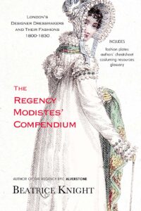
Beatrice Knight’s Regency Color Compendium

The evolving Regency fashion and textile industry did exactly what today’s designers do; they rebranded colors to stay trendy. With names like jonquille, ponceau, and dust of ruins, the Regency color palette can be confusing to navigate, and without color-fast pigments, some shades did not resemble those familiar to us today. This post shares some the research for my Regency Color Palette, which will be published in my forthcoming Regency Modistes’ Compendium. As soon as it’s available for order, the link will be posted here. Meanwhile, sip tea and explore!
The Regency Color Palette is a comprehensive index of over 200 colors mentioned in magazines from 1800 to 1830. I’ve listed some 60 of these below, as a resource for readers interested in fashion history or historical costuming. Each is accompanied by a swatch that shows how the color was depicted in a fashion plate – the year and periodical name are referenced. The dates on these swatches are not “first time in use” but refer to a specific example. Werner’s Nomenclature of Colors (1814), which established a Regency era classification of colors using nature and minerals as a reference, is also a useful resource for anyone doing a deep dive on colors.
How did Regency textiles look in real life?
Because surviving garments and textile samples are not conveniently labeled ‘celestial blue’ or ‘Apollo’s hair’ most colors in the Regency palette cannot be verified via object research. However, objects in museum collections around the world show that many of the shades in the Regency spectrum were more vibrant and saturated in person than represented in a hand colored print engraving. So, if you are sewing a reproduction gown in one of the stronger colors, you are probably safe to veer toward the richer end of the scale. Keep in mind that when a Regency gown was first made, the textile would have been at its optimum color depth before fading. As a broad rule, the further toward the 1820s, the more vibrant the colors in the Regency palette.
Pastels are more easily classified. I’ve seen many well-preserved gowns in shades I would identify as primrose, blush, apple blossom, and so on. Those colors were soft and delicate. From 1800 to 1815, whites and pastels dominated morning, walking and evening gowns, with stronger colors usually confined to outer wear, trains, shawls, cape linings, and special event costumes. In ‘full dress’ combinations, the slip was typically white or pastel; the robe over it made the color statement.
Color names were inspired by events
Magazines like La Belle Assemblée, Ackermann’s Repository, the Ladies’ Monthly Museum and others reflect a Regency fashion industry quick to exploit preoccupations of the day, such as Egyptology, foreign travel, and the prolonged war against Napoleon. The latter inspired martial-themed designs drawn from military uniforms, regimental colors, battles, and locales. Hot on the heels of a splendid victory at Vitoria, for example, the Lady’s Monthly Museum (August 1813) declared:
“VARIETY, flitting from hue to hue, from costume to costume, reigns paramount in the habiliments of the English female; our couturières are not insensible of British valour, well knowing, that, next to military glory, the British fair is the prize for which Britons fight; every trophy, color, or device, that can eulogize the Hero of Salamanca, of Ciudad Rodrigo, and Badajos, is therefore adopted with avidity by the Ladies, in honour of his exploits.”
Textile dyes
Very few Regency dyes were colorfast. The vibrant aniline dyes that characterized Victorian fabrics were not discovered until 1856. Regency textile manufacturers relied largely on plant and mineral dyes, so garments faded, especially those laundered most often. Puce, for example, started out as a deep purplish crimson and faded to a dusky mauve; cerulean blue tended to become more greenish; coquelicot could fade to a light coral. Although whites and pastels were more difficult to clean, and therefore a status symbol, fading was not a problem, so a well-maintained pale gown looked newer for longer.
Reverse Engineering the Regency Color Palette
The complete Regency Color Palette (as published my Modistes’ Compendium – forthcoming February 2024) profiles more than 200 color names in use from 1800-1830 and includes a set of over 100 HEX swatches. These provide a unique guide as to how Regency colors may have appeared in person. The HEX swatches depict a well-saturated medium shade as a ‘baseline.’ Lighter or darker variations were seen in Regency era textiles.
The HEX swatches differ significantly from the colors seen in Regency fashion plates. It goes without saying that a faded and discolored 200-year-old plate, which was originally hand-colored, provides at best a ballpark depiction of a color. As part of a fashion plate restoration project, I developed a color correction method that enabled me to reproduce, with some level of accuracy, the appearance of a plate when first published. However, even then, any color in a fashion plate differed significantly from its appearance in person in a garment. This is especially true for colors outside the pale pastel spectrum.
To evaluate the delta between a fashion plate and real life, using print, art, and object sources is a hopeless quagmire. Fortunately, I stumbled onto a Rosetta stone of sorts, a set of examples that enabled me to ‘reverse engineer’ their appearance in fashion plates. I back-tested my methodology on various objects, which were either very well preserved or had unexposed areas, such as inside hems and seams. The focus of this back-testing was on primary and secondary colors, not on specific fashion shades. Back-testing showed my reverse engineering technique to be surprisingly predictive of ‘real life’ color.
The process is described in detail in the forthcoming Modistes’ Compendium. The HEX swatches present Regency colors recreated using this technique. Not only did I find colors could be reimagined with more accuracy than expected, I was able to identify object colors as particular Regency fashion shades, or narrow down the options.
I hope my color palette will prove to be a handy and interesting reference for Regency costuming sleuths. Here are some of the HEX colors included:


Blue
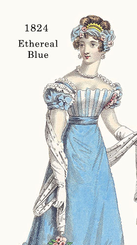


Regency women just couldn’t quit celestial blue. The color first appeared in English writing in 1542 to signify a lighter alternative to azure in heraldry. The discovery of cobalt blue by French chemist, Louis Thénard in 1799 cast a spotlight on vibrant light blues, and celestial blue fast became a signature color . La Belle Assemblée featured a Roman spencer in the hot new shade in 1807 and it reached peak popularity from 1812 to 1817, but never went completely out of fashion. More intense tones were favored for promenade outfits, cloaks, and pelisses in heavier fabrics. Virtually interchangeable was the shade ethereal / etherial, which became especially fashionable when brighter colors replaced white for evening wear. Through 1824, La Belle Assemblée featured several dresses in the shade (such as the ball dress above) and declared it “prevailing.” In 1826 they served up a ‘home dress’ in the enduring shade. Celestial blue was yet again listed among the most fashionable colors of 1828 / 29 in the Lady’s Monthly Museum.
Blue, with its martial and patriotic symbolism, was especially popular during the Regency era, when war was uppermost on the minds of most Britons. Halfway between blue and cyan on the color spectrum, azure blue has been referenced in English publications since the 14th century and was defined by Werner in 1814 as comparable with the color tones of grape hyacinth. It was a wardrobe staple throughout the early 1800s. In September 1825, Ackermann’s featured (above) an “Azure crepe lisse dress, over a white satin slip ; the corsage rather long and full, and arranged in small regular perpendicular plaits, of a moderate height, and finished at the top with a pale azure satin band.”
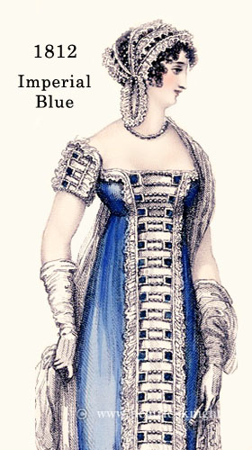
Royal blue, more often known as imperial blue back then, is the darkest shade of azure. Also referred to as French blue (The Times, 1802) and sapphire blue, it is a medium dark blue shade a Regency draper would have kept in stock. Shown above, the 1812 plate from La Belle Assemblée features a robe of imperial blue designed for an opera or gala.
Based on the contents of women’s fashion magazines of the time, it seems that very similar fashion colors were marketed under catchy names just as they are today. Bright, pale tones of azure went by various names, such as Arctic blue and Haytian blue (Ackermann’s 1826). Not unlike the color we know as “baby blue,” Clarence blue was a favorite for spencers from 1816-1819 and considered to be in good taste for all ages.
Saxon blue was an indigo-based lavender blue sporadically in favor during the Regency years. It never got the same traction as shades like celestial blue, and it was a tad definitive for half-mourning, so the more subdued lilac and lavender got the better of it.
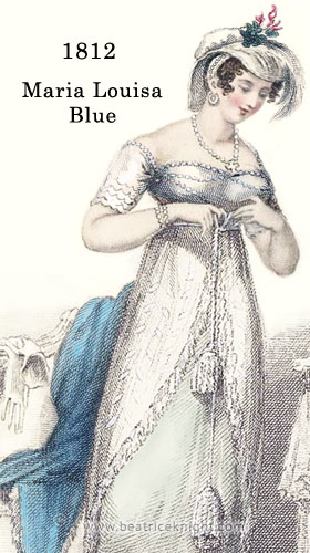
Maria Louisa blue was the signature color of fashion influencer, Princess Maria Louisa of Baden, who married Tsar Alexander I of Russia. A calamine blue, it was described in La Belle Assemblée (1813) as “…a dye of peculiar éclat, between the bright cerulean and the Clarence blue.”
Cerulean blue was a fashionable color both in furnishings and apparel. Created by mixing cobalt and copper, the deep color was relatively fast for the times. Being a rich hue it was was more likely to be seen in hats, wraps, accessories and trim, than in a dress, and it was also a color favored more for married women, than singles. The young matron depicted with her infant in Ackermann’s Repository, June 1812 is wearing: “A loose Circassian pelisse of cerulean blue sarsnet, with low curved bosom…”
Egyptian blue has ancient origins. During Napoleon Bonaparte’s Egyptian campaign in 1798, artifacts glazed in a deep bright blue were brought back to Paris, sparking interest among both chemists and archeologists. As the Egyptology craze swept England in the 1810s, Humphrey Davy, was among a group of scientists who carried out excavations in Pompeii and found fragments of blue in frescoes at the baths of Titus. Identifying soda, silica and copper oxide in his subsequent analysis, he concluded the samples matched the blue described by Theophrastus as manufactured in Alexandria. Textile dyes lacked the intensity of the blue artefacts, so efforts to market Egyptian blue as a fashion color met with limited success .
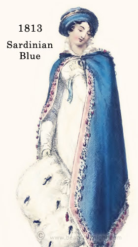
Sardinian blue came into fashion when martial themes were at their peak during 1810 to 1815. Inspired by the color of the Sardinian Army uniform, it remained popular until the French were defeated. When Napoleon invaded Piedmont in 1797, the Sardinian army stood against him at first, alongside Austria and England in the War of the First Coalition, but withdrew with low morale, leaving the French to seize control of Northern Italy. The English apparently bore no grudge and Sardinian blue was added to the Regency color palette.
China blue became a fashionable dark blue in the 1820s when Chinoiserie porcelain was suddenly trendy again. A dark sapphire color similar to Imperial blue, it was favored for Redingotes, riding habits and outerwear, and was seen more often in men’s attire. Werner (1814) classified China blue as a mix of dark Azure and Prussian blue.
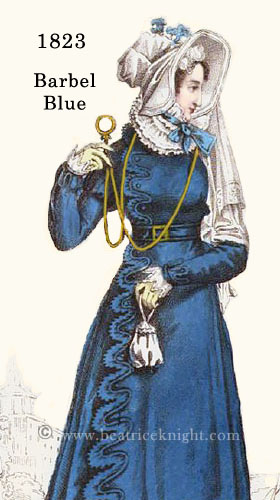
Known as a fashion color before 1800, Barbel blue was said by the Morning Chronicle (31 August 1801) to be: “—dying away.” It was revived in 1818 and in November 1823 La Belle Assemblée featured the shade in a carriage costume, which depicts a medium dark azure similar to Sardinian blue. To confuse costumers a light shade of Barbel blue popped up occasionally and was likened to ‘sky blue.’
Prussian blue was invented in 1706 when a Berlin paint manufacturer, Johann Diesbach was formulating a cochineal pigment and discovered a contaminated potash made it turn a pleasing deep blue shade. He collaborated with the potash supplier, Johann Dippel, to create Prussian blue. Their dye, also known as Berlin blue, was unusually colorfast and rapidly replaced less stable blues. It was adopted by the Prussian army for their distinctive uniforms and hit its stride during the Napoleonic wars, when the Prussian campaign took center stage in 1813. Suddenly the beau monde could not get enough of Cossack coats and Prussian blue great coats. Ackermann’s Repository (1815) published remarks by an Englishman in Berlin, that along with royal purple…”…the Prussian blue boots and slippers are in honour of the Prussian army… This is becoming the dress, and will be the winter dress of the court, the nobility, and fashionables of the Prussian dominions.” Early in 1816, the carriage dress (left) was featured in La Belle Assemblée, described as “dark blue” but obviously Prussian blue. The color has never vanished from fashion.
RED / PINK / PEACH


“Pink is a perplexing color for these walls,” Lord Alverstone said as they entered the British Institution’s picture gallery in Pall Mall.
“Whatever can you mean?” cried Aunt Stirling, who thought every shade of pink desperately smart, and not only because the French adored it.
Alverstone, by Beatrice Knight
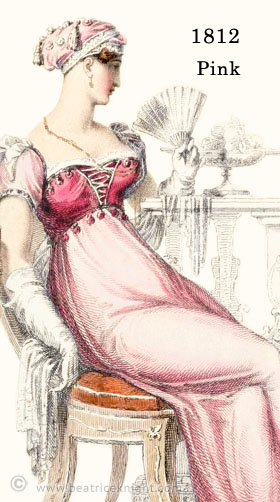
Pink was always in style during the Regency era and looked no different from pink today. Deeper pinks, known as rose, were seen throughout the era, and as the 1820s unfolded and the color palette shifted away from pastels, rose shades became more intense and even more popular.
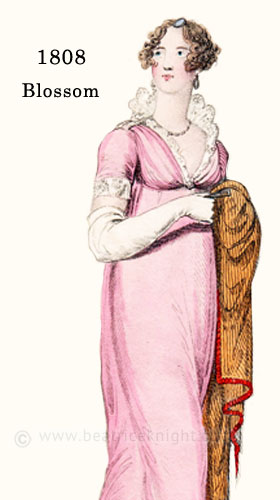
A popular Regency pink was blossom, a magenta pink originally known as Pompadour. Its lightest iteration was apple blossom. In the early 1800s, blossom gloves were a genteel alternative to white kid at balls. In June 1808, La Belle Assemblée featured a dress of “—blossom-coloured muslin over white cambric…”, and Ackermann published a blossom evening gown in 1813. Reticules made of blossom velvet or silk were very popular from 1810 to 1820 and were seen in its deepest shade.
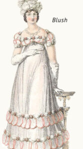 A pale peach-pink, blush was probably close to the shade we think of as “nude” these days. In plates it is hard to distinguish the various light apple or peach blossom tones. After losing ground, the peach version had a big resurgence in 1819, until in September that year, Ackermann’s “votaries of fashion” noted: “…peach- blossom seems to be little worn…”
Blush was especially popular for silk “slips,” ie. the dress worn under a pelisse, spencer or thin layer of another color. It seems to have been very similar to the color known as flesh in 1801-1804, when it was favored for gloves. By 1811 it was being promoted as the more appealing maiden blush. As blossom became a tad commonplace, shades of blush were seen more often from 1813 onward. At a time when white dominated evening wear, it became a favorite alternative during 1817, appearing in multiple fashion plates, including the example (right) from The Repository.
Ruby was never entirely out of fashion through the Regency years. A color that still speaks of luxury, it was seen most often in silks, satins, and trims. A cloak lined with ruby satin would have been a coveted wardrobe addition for fashionable women of any age. La Belle Assemblée, featured a ruby evening gown in 1814, and was far from the only example seen in magazines.
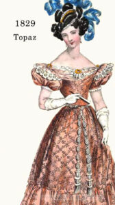
A deep version of blush, topaz came into fashion as British and Russian dignitaries engaged through the Regency years, and reports of the rare pinkish-orange gem intrigued the English upper class. Not to be confused with the affordable pink topaz of today, which gets its uniform color from radiation treatment, so-called “imperial topaz” was mined solely in the Czar’s mines and was not sold on the open market. Fine examples were sometimes given as gifts by the Russian royal family, so the stone was a status symbol in England. It was referenced as a fashion color in La Belle Assemblée in 1810, and in 1829, Ackermann’s featured it in a Parisian ball dress. The color is very similar to aurora.
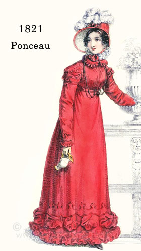
Ponceau (meaning “poppy-colored”) is a vivid scarlet red that existed as a fashion color alongside the other “poppy” shade coquelicot throughout the Georgian era. Both colors were referenced in the 1787 order book of French modiste, Madame Eloffe, a favorite designer of Marie Antoinette’s. Ponceau does not have the distinctly orange tone present in coquelicot, and was also popular among gentlemen. It enjoyed a burst of popularity in early 1820, but Ackermann’s readers were informed in Eudocia’s June “letter” from Paris that it is now: “not worn.” Hopefully, women kept their ponceau garments, as ponceau had one of its best years in 1821, featured in Ackermann’s, the Ladies’ Monthly Museum, and other publications, including during the summer months when it was pronounced “very unsuitable to the time of year” but “much in favor” for ribbons and trims. It was a color made for the 1820s, especially favored for trims, hats, and outerwear. In 1828, the Lady’s Monthly Museum noted it was used as a broad satin ribbon “puff” on the crown of a hat of cabbage-green gros de Naples, and included it as one of the most fashionable colors of that year for garments also.
Coquelicot, French vernacular for the wild corn poppy, has orange tone absent from ponceau. It saw bursts of popularity throughout the Regency era, and featured often as hats or trim. It was referenced between 1795 and 1805-06 as a fashion favorite. La Belle Assemblée listed it in March, 1812 as a “prevailing color,” and in 1823 it was featured by Ackermann’s. Jane Austen herself was a fan of the color, and mentioned in a letter (18th December, 1799) that she intended to use a coquelicot feather to decorate a hat “as being smarter, and besides coquelicot is to be all the fashion this winter.”
 Morone was a stalwart for winter fashions and accessories throughout the Regency. A Calypso wrap in morone velvet was featured in December 1807 in La Belle Assemblée. but especially popular in 1812-1814. The name derived from the French marron (chestnut). A versatile brownish red with a hint of purple, it was a look adored by matrons of a certain age, who wore it frequently in pelisses cloaks and carriage dress as seen in the kerseymore coat (right) featured in Ackermann’s 1813. Described as a spencer richly braided in gold a la militaire, it was tailored for women by Mr. Barry, who specialized in making riding habits.
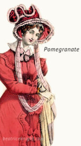
Among the deep reds popular in the 1820s, pomegranate was occasionally depicted in a more purplish tone, but most often was seen in a medium earthy red. In December, 1825, Ackermann’s featured it, noting that morone and terre d’Egypte, similar shades, were also top fashion choices for winter. The same publication showcased pomegranate in a promenade dress in November 1826. The color remained in fashion beyond the end of the era.
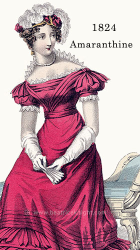
Named for Amaranthus caudatus “love lies bleeding” this rich slightly purplish red was especially popular in the early 1800s, appearing in multiple issues of Ackermann’s Repository and La Belle Assemblée from 1810 onward. When vibrant shades become popular in the 1820s, amaranthe/amaranthine shades were among the reds most favored. The 1824 plate above, from Ackermann’s, featured an evening dress in “amaranthine colored” gros de Naples accessorized by a turban trimmed with “full blown Amaranths.”
A rich purplish red, claret was, not surprisingly, a popular hue among Regency gentlemen, seen in waistcoats and tailcoats, but not in breeches. Women used it most often for accessorizing: wraps, ribbons, reticules, hats, turbans etc. and preferred Beet-root for dresses. It was sporadically popular, poking its head up as a fashion shade in 1802, 1814, and 1825.
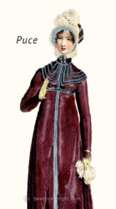 In 1775, puce was described by Lady Spencer in a letter to her daughter the Duchess of Devonshire, as the “the uniform at Fontainebleau and the only colour that can be worn…” A deep brownish purplish red, it took its name and hue from blood-engorged fleas. You can be sure the celebs of 1775 knew exactly what the tiny parasites looked like, since their clothing, wigs, and beds, were generally infested with them. Not color-fast, it faded out to a grayish mauve color sometimes called “light puce”. Even after most of the French aristocrats who wore it were sent to la guillotine, it remained popular as the 19th century began.
The Lady’s Magazine listed it as a “prevailing” color in 1805. At some point it must have seemed rather “yesterday” for it started to be eclipsed by colors like pomegranate and morone by 1810. Prominent modiste, Mrs. Bean, however, gave it something of a last hurrah in December 1814 (Ackermann’s, plate right). It was rarely seen after that. Undoubtably, the young Regency matron thought of it, by then, as a grandmother’s color. However, when richer tones dominated in the 1820s, puce made itself felt again. In February 1824, La Belle Assemblée remarked on a gown of “puce-colored Levantine” with a beautiful trim of amber crape and satin rouleaux bordering the hem.
Among the deepest reds, cherry-color, as it was known, remained “in request” throughout the Regency era. It was especially popular for trims and headwear, and often paired with yellows and golds.
In Rudolph Ackermann’s Repository (April 1815), addressing the problem of color fading, the Count de la Bontaye announced that he has:
“discovered the means of dyeing unalterable colours, the composition of which is perfect ; viz. blue upon wool and silk; green, yellow, violet, and nine other colours ; to wit, a yellow upon wool, as strong and more brilliant than the former; two greens, one of which will resist the action of fire itself; two fine blacks, one without copperas, which can neither burn nor harden silk any more than wool ; and another, which resists sidjjhuric acid, potash in a slate of ebullition, as well as the action of the sun and air; an unalterable puce colour ; a crimson on silk, much cheaper and more durable than cochineal ; and, lastly, a pure pink, completely unalterable through all the shades of flesh colour. ” Add to these twelve new colours,” says he, ” which may be obtained pure in all their shades, a very beautiful white, never liable to turn yellow, which I have succeeded in giving to wool as well as silk, and which spreads much more than their natural white. If we only add to this, the fastest colour of the ancient dye, or the fine red yielded by Alkermes, to fill the palette, and the problem will be solved.”
PURPLE


Traditionally, indigo (a plant) had been used to create affordable bluish purple tones, and that continued throughout the Regency, as aniline dyes, which are vibrant and colorfast, were not invented until in 1856. Indigo colors bled out quite quickly to shades of grayish lavender. A more long-lasting option was Tyrian, or royal purple dye, which was extracted from sea snails, and transformed yarns to a range of beautiful tanzanite-like hues. The history of the rather revolting Tyrian purple pigment process is described in Wikipedia, if you want to learn more.
Because the dye was exorbitantly expensive, deep purples were a status symbol color historically associated with royalty and power. As the war with Napoleon went Britain’s way, and middle class wealth began to explode, rich purples were more widely seen, especially in the late Regency era when the wealthy nouveau riche were dressing to impress. Before 1820, lighter purples like lavender and lilac were far more prevalent.
Among these lighter shades amethyst was hailed in 1810 after the discovery of large deposits of amethyst in Brazil made the gems more affordable. Prior to the 19th century, amethyst was mined only in Russia and was as costly as ruby. It was worn by royalty, princes of the Church, and the very wealthy, so when the middle class could obtain the coveted gem without having to sell their firstborn, amethyst jewelry and matching attire soared in popularity. These days, the very finest color of untreated natural amethyst, regardless of origin, is known as “deep Russian” because of this history, and resembles the Regency color known as Parma violet.
If you’ve browsed Regency fashion plates, you’ve probably noticed very similar colors described as lavender or lilac – not helped by aging and yellowing. I’ve tried to find some examples that differentiate, and was guided by Werner’s (1814) color charts, which suggest as a reference for lilac, the spots on the peacock butterfly wings.
Lavender was nearly interchangeable with gray as a color suitable for half-mourning, while the more rosy lilac was a versatile shade, worn as a fashion color as well as a subdued transition shade after the conclusion of half- or slight-mourning. Werner’s advice on lavender suggests dried lavender flowers as a guide. The light greyish purple of dried lavender bunches is certainly very similar to the color featured by Ackermann in 1821 (see swatch). The fashion plate example (right) hails from September 1823, depicting a morning dress in lavender lutestring.
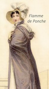 In 1821, the Ladies Monthly Museum described flamme de ponche as a favorite color that “partakes of lavender grey, pale yellow, and dark lilac…” in other words, the kind of indefinable hue seen in shot silk and certain wool textiles. It must have been hard for the colorists who had painted fashion plates to replicate the hue. The 1823 Ackermann’s plate (right) depicts a “Cloak or mantle of levantine silk, of flamme de ponche colour…” and a dress in pale primrose. Flamme de ponche had a good run throughout the 1820s, being mentioned as a fashionable color multiple times. Near the end of the Regency era, it was depicted in The Ladies’ Pocket Magazine (1830).
Mulberry is a dark earthy reddish purple that showed up from time to time as a fashionable color in fashion magazines. It appeared in La Belle Assemblée in 1810 and then, rather confusingly, in an Ackermann’s plate in 1816 that depicted mulberry as a dark greyish violet shade. From my research, the 1822 Ackermann’s plate (right) best represents the color as it was understood during the Regency. Who can say what happened in 1816, but sometimes plates (which were hand colored) did not match descriptions in fashion magazines of the time, probably because of a publishing disconnect.


GREEN


Pomona green was the defining green of the Regency era. It leapt to fashion prominence in 1809 when Lady Charlotte Nelson (niece of Lord Nelson) wore a lavishly embroidered Pomona green train to the King’s Birthday celebration at court. A distinctive vibrant emerald toned apple green, its viridian component and luminous quality was imparted by Oxide Green Chrome dye. Used in both furnishings and clothing, it quickly superseded the lighter apple shade American green, which was trendy from 1800 to 1808, and vied with pea-green and spring green for fashion dominance. By 1811, it was *the* green of the beau monde. Crown Prince Bernadotte’s rooms in Castle Rosendal were decorated in Pomona green. In September 1813 Ackermann’s featured a “Vittoria cloak, or Pyrennean mantle, of pomona green sarsnet, trimmed with Spanish fringe…”
Spring green was the Georgian forerunner of Pomona green. First observed in the 1760s, it was still a favorite at the turn of the century, appearing in 1802 fashion plates and descriptions, along with another stalwart, pea-green. These greens must have seemed passé when Pomona green exploded onto the scene, for they faded from fashion after 1810, with spring green sporadically appearing every few years. In the mid 1820s it was seen again, when more intense colors were in vogue. Some fashion plates depict Spring green as a very dark bottle green. Perhaps the plate colorists of the day used whatever pigment they had at hand.
While Pomona green dominated the Regency élégante’s wardrobe during the early- to mid-Regency period, emerald green had its fans. In 1810, Ackermann’s described it as “exceedingly elegant” for women’s fashions. It was widely used in home décor, especially as wallpaper in newlyweds’ bedchambers, since green was thought to promote fertility. In the Regency rag trade, emerald green was mentioned more consistently after 1810 and hit its stride in 1817, when it eclipsed Pomona green in leading fashion magazines. The emerald green pelisse (right) was featured that year in La Belle Assemblée. Its popularity continued for the rest of the era. In 1829, Ackermann’s listed it among the most popular colors of the year.
Unfortunately the pigment initially used to create emerald shades was arsenic based. It had its origins in 1775 as Scheele’s green, named for the man who formulated it, Carl Wilhelm Scheele. Its use in home décor led to illness and death for countless people. It is even thought that Napoleon Bonaparte may have fallen victim, dying in exile at age 51. While his autopsy showed he had stomach cancer, multiple samples of his hair, tested in recent times, showed chronic exposure to arsenic prior to his arrival at St. Helena. Napoleon’s apartments had been lavishly decorated in Scheele’s green, his favorite shade, and that may explain the arsenic, although some people believe he was intentionally poisoned.
After some bad publicity, the pigment was rebranded as Paris green and continued claiming victims through the Victorian and Edwardian eras. It was finally banned in the 1960s.
Spanish fly, no–not the aphrodisiac–was a rich emerald green fashion favorite from 1800-1809. Magazine editors must have decided the connection to virility was a tad indelicate, because “emerald green” was used more often from 1810 onward. Spanish fly was usually depicted as a medium to dark emerald, as it was in the 1808 plate (right) published by La Belle Assemblée. The color made a re-appearance in 1822, when it was featured in that magazine’s October issue.
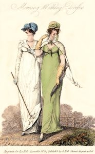
Of the pastel greens, sea green and willow green endured through most of the era. These colors were favored for both morning and evening wear (see the 1812 dress with the Maria Louisa wrap in the Blue section above).
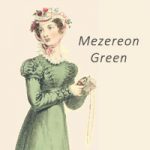 Another soft green was mezereon, named for the shrub . Similar colors came and went under different names such as sea green, often simply being termed “light green.” The pastel greens never made fashion statements like Pomona or Spring green but they could be found in most wardrobes. Ackermann’s published the plate (right) in 1823.
Cabbage green aka vert de chou came into fashion in the late 1820s, when it was thought to be a very French color perfect for the élégante who could not be seen in greens like spring or Pomona…so yesterday, non? In June 1829, in the last collection of fashion plates they would publish, Ackermann’s featured the “Parisian evening dress” (right), a gown of crape over sarsnet with sleeves à la Maintenon.
Among the greens popular in the early 1800s, pea green was never thought out of fashion between 1805 and 1817. More yellowish than emerald green, and more olive than Pomona green, it appeared in La Belle Assemblée in 1808 and in Le Beau Monde magazine. It was named a favorite color in 1813 and remained seen in Regency attire until 1818, and then had a half-life in trims and accessories.
The marriage of Charlotte, Princess of Wales to Prince Leopold of Saxe-Coburg was the big event of the 1816 season, spawning a spate of “Coburg” fashions, among these: Coburg green.
Not subject to rebranding, Olive green was never out of fashion, especially for the Regency gentleman who wore the darker shades of olive in dashing tailcoats of superfine. The deeper hue was featured as a women’s evening dress in 1804, but the lighter olive tones, especially flattering for auburn haired women, were more popular during the first half of the Regency, especially in 1812-1814, when Ackermann featured more than one evening dress in pale olive at a time when white was all but universal for ballrooms.
Bottle green seems to have been with us forever, and seems interchangeable with rifle green. Both colors were referenced throughout the Regency and before, especially in riding habits and gentlemen’s attire.
Named for the vivid neck and head feathers of the male mallard duck, this rich blue/green was rather like a cross between cerulean blue and bottle green. The dye that created it was called drake’s neck in the Georgian era, and the color was referenced a few times during the Regency era, including by Ackermann in 1810.
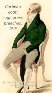 Corbeau emerged during the Georgian era as a fashionable shade for gentlemen, darker than bottle green, but not black. It was mentioned in a number of fashion publications from the 1780s to the late Regency era. In early 1810, Ackermann’s depicted a gentleman in full dress attire, and proposed these fashionable color choices: “…Superfine corbeau colour coat, with covered buttons; white marcella waistcoat, single breasted; light sage green… kerseymere breeches…” (Note: the original plate showed a gentlemen in a chocolate brown coat – I re-tinted (see right) to correspond with the color cited in the text.).


YELLOW / ORANGE


“…full yellow is also too common to find a place in a select wardrobe.” La Belle Assemblée. September, 1808.
Jonquille / Jonquil, the daffodil color, was the go-to Regency yellow. Not every woman found it flattering, but it was in their wardrobes nonetheless. Referenced fairly often from 1807 onward, it vaulted to fame around 1810 and remained au courant, until by the end of the 1820s, jonquil had become so ubiquitous that magazines tried to reinvent it under different names. The carriage dress (right) was thusly described (Ackermann, 1829) as “between a straw and an oiseau de Paradis…” – in other words it was jonquil, as I have labelled it for this guide. The swatch (left) shows how jonquil was depicted in varying shades. The most vibrant is a well saturated medium jonquil, which is how it may have looked in a new fabric.
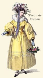 Bird of paradise yellow, or for the most la-de-dah Oiseau de Paradis, leapt to fame when richer, brighter colors were embraced in the mid to late 1820s. As stated, it was basically the brightest shade of jonquil-like yellow marketed by a trendy name. Having discovered the bird of paradise, feather traders of the era could not wait to pillage the population to ornament 19th century hats and head-dresses. Unlike many species decimated for profit, this one managed to escape extinction and still prospers in the wild in Papua New Guinea.
The most delicate of the yellows, primrose was a fashion staple of the Regency era, especially favored by young women. Evening primrose is mentioned quite often in fashion magazines, but the color is quite different from the paler shade, and was an awkward choice for many typical English complexions.
Straw was a light warm golden yellow that looked like…yes…straw. Referenced as a fashion shade in the 1760s (Jefferies), it endured, and was especially popular for kid gloves and shoes between 1804-1808. La Belle Assemblée featured long kid gloves of straw color in a September 1807 fashion plate, and a straw evening dress in 1813 (right). The popularity of the shade endured throughout the entire Regency. Many women found it a kinder shade to wear than jonquil or lemon, which tended to make some complexions look sallow.
Although jonquille leaps to mind as the epitome of a Regency yellow, lemon, also called citron, was never out of fashion, especially for gloves and half-boots. It was easier to maintain than white kid, more delicate than York tan (which was not typically worn for evening occasions), and remarkably versatile. A women could wear her lemon kid gloves anywhere, all day, and although white kid was essential for balls and opera, lemon could be worn to many evening events instead of blossom.
Nankeen was not just the name of a color, it was a fabric made in Nanjing, China from a particular variety of cotton plant, which produced a yellowish fiber without the use of dye. Later, when the dirty-yellow color became synonymous with the fabric, plain cottons were dyed to replicate the original. During the Regency era, most nankeen was natural. Fashions of London and Paris featured a nankeen pelisse in July 1800, and a three-quarter jacket/dress in 1802. However the sturdy, breathable cotton used more often for men’s clothing than women’s, and was favored by sailors on British naval vessels. A hot look for gentlemen was depicted in the 1807 Costumes Parisien plate (right) as a dark navy coat, top boots, and nankeen breeches.
In 1813, everything was about Cossacks and modes a la Russe. In step with the zeitgeist, Ackermann’s hailed the “new Russian flame-color” (right). This shade was a warm light pinkish tan, like a light topaz, that, along with Amber, was one of the fashion colors of the year.
By then, amber had been referenced continuously as a “much worn” fashion color since 1808. It was not new in fashion, having first been referenced as a color in the early 1500s. Halfway between yellow and orange, its burnt sugar notes were more flattering than pure yellow for many Englishwomen. From the most indicative plates, it was worn as a vivid color, usually in velvet or silk. In February 1811, Ackermann’s (right) featured a “military coat or pelisse of amber-coloured velvet, or Merino cloth, with Spanish cuffs…An Algerine helmet cap of the same… ” and also a light amber evening gown. In 1812 La Belle Assemblée promoted a rich amber evening dress. It must have seemed a bit ‘yesterday’ as the 1820s came around, as it was accorded other quirky names. During 1826-28, modiste, Miss Pierpoint revived amber in 1826-28 in some of her characteristic designs, leaning more toward the reddish side of the scale in the carriage dress promoted in the Ladies’ Monthly Museum (left).
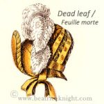 In the amber family, Dead leaf or, for classy French speakers, feuille morte, was fashionable for autumn hats and ribbons, as featured in 1812 by La Belle Assemblée (right). The color climbed in popularity from 1818-23, appearing in dresses, mantles and pelisses, especially for the autumn wardrobe.
Aurora, in the few plates that represent the color, looks like a pleasing blend of amber and orange with a small dash of red. The plate (right) from Ackermann’s 1824 displays aurora in a striped dress with purple and green. It was the 1820s, and bod color combinations were all but mandated. I have seen poppy red labeled ‘aurora’ in some posts around the internet and would be curious to know is it was marketed as a more reddish color during the 18th century.
Orange, being a difficult color for Englishwomen of the palest complexions, was never as popular as lemon or primrose. Most often it featured as trim, but in January 1814, one of the coldest months on record in England, Ackermann’s published the plate (right) featuring a cozy looking merino wool promenade coat in orange, and a huge ermine muff, just the thing to wear to the Frost Fair on the Thames River early in February that year.


BROWN / BEIGE


If there was one pair of gloves indispensable to the Regency woman, it was York tan. None other than Elizabeth Bennett (immortalized by Jennifer Ehle) wore a pair in the 1995 TV series Pride and Prejudice. (Still unchallenged as the standard-bearer for Regency-set films and TV series, imo. )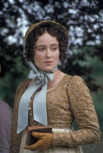
A natural looking buff color, they did not show dirt as rapidly as white kid or lemon, and cleaned up more easily. York tan gloves were mentioned in fashion magazines throughout the Regency era. The Ladies’ Monthly Museum, 1802 gave them a shout out and they became ubiquitous from 1804 onward. During the very early 1800s, they also doubled as evening gloves but after 1810 white or pale pastel gloves were deemed the more genteel option for London ballrooms. Ackermann’s featured York tans in a June 1809 fashion plate, and in a longer style pulled over the elbows in 1814 (plate top right), but most often they were worn short.
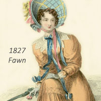 Fawn was a wardrobe staple for the Regency woman, just as it is nowadays. It was also a top choice for gentlemen, whose breeches and pantaloons were often seen in fawn, buff, and beige tones, all of which correspond to the colors we know in present times. Fawn was referenced many times throughout the era, regularly appearing in plates from 1806 onward. Its depiction by Ackermann’s in 1818 (right) is a representative example. Their 1827 plate (left) depicts a richer version, in step with the emphasis on more vivid colors that prevailed from the mid 1820s onward.
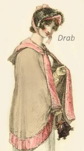 Yes drab was actually a color, not just an adjective. It looked like a soft greyish beige with a hint of nankeen in some variations. In 1809, Ackermann’s remarked on a look for gentlemen comprising: “Breeches of drab silk hose, not made very high: the knee-band low, with four or live buttons at the knee. They are made rather tight.” Drab was also intermittently fashionable for women until brighter colors prevailed toward the mid 1820s. In 1812, Ackermann’s featured: “A Russian mantle of fine drab cloth, lined and bordered with rose-coloured satin…” (left) and in 1816, drab and lilac were a fashionable color combination. An 1820 Ackermann’s plate (right) depicts a “cottage dress” in drab bombazine.
Shades of beige, tan and brown were marketed under some fanciful names, usually inspired by themes captivating the beau monde at the time, among them Egyptian brown (1809), purportedly representing the skin color seen in tomb paintings, and its later, deeper version Terre d’Egypte (1824-27), a brick shade not unlike a very dark pomegranate. Dust of ruins (early 1820s)was a grayish light tan compared to squirrel, and camelopard (meaning giraffe, and often misspelled “cameleopard”) was a French beige that leaned toward light brown.
Among the neutral tones, stone was chic between 1812-1816. The color appears to resemble a mix of buff and very light puce (a grayish mauve ). It La Belle Assemblée, March 1813 featured a stone promenade outfit (right) that characterized the look of 1811-1814 so overtly that the “Observations” section of the fashion column, labeled it a “Regency habit” and noted “Regency mania is still as strong as ever.” The outfit was described as: “A stone coloured habit, trimmed round the body with swansdown, and ornamented entirely across the bosom with a thick row of rich silk braiding to correspond…” Colors marketed as dove and dust of ruins were similar to stone.
Egyptian brown has unpleasant origins in mommia or mummy brown, a pigment used by 18th-19th century artists, which was derived from the ground up remains of exhumed mummies, mixed with additives to bring out a rich tan/brown color. When its sordid origins were publicized, demand vanished for a few years and the color was reinvented as Egyptian brown, minus the human remains. In 1820 Ackermann’s featured it in a walking dress (right).
Lord Byron, the passionate, privileged, rebel poet was often seen wearing rich shades of brown. Given his celebrity, it’s surprising that the Regency fashion world didn’t cash in on his name sooner, but perhaps editors decided to wait until his exploits were no longer frightening the horses. Byron died in 1825, and in a modest homage Ackermann’s published the plate (right) in 1829 as a gown in Byron brown while also featuring a similar shade as boue de Paris.
In 1822, Oeil de Mouche (meaning fly’s eye) was a promenade must-have for winter in Paris, according to Ackermann’s, and in 1823, it was hailed in the same publication as one of June’s fashion hues. It’s not easy to find an illustration of this color anywhere, but based on an old French plate I tracked down, it seems to have been a dark take on Carmelite brown, aka hermit brown. If anyone has a published source for information about this color, do contact me. Another of these blackish browns is the horridly named tête-de-nègre, which was described in the Lady’s Pocket Magazine (1825) as “very, very dark brown tinged with crimson.”


BLACK / GREY / WHITE / CREAM


White was the default color for the beau monde during the Regency era, especially for young women’s dresses, and of course, men’s shirts and neckcloths. Upkeep was pricey (more frequent replacement and a lot of extra laundering), so wearing fine white garments was synonymous with privilege. A woman could fashionably promenade in a beautiful white cambric round robe, with a spencer or pelisse in a fashion color, any month, of any year until 1826. In off-whites, Isabella, was broadly known as a palomino cream shade from the 1600s. In 1712, the Spectator referenced it as a color of fashionable attire. It remained in favor through the Georgian era and into the Regency, being cited as late as 1820 in Ackermann’s. Various legends surround the name. Supposedly, in 1492 Isabella of Spain refused to change her gown until Granada was back in Spanish hands, and the once-pristine white background silk became faded, rusted and grimy. Another legend has one of the queen’s descendants pledging not to change her small clothes until the siege of Ostend was won.
I’ve seen a few undated examples of Isabella around the web, which appear very yellow. Based on my research, the color was more of a golden cream during the Regency, but if anyone has contemporaneous examples showing otherwise, do send them! Other popular off-whites included the usual suspects ivory and linen. Lace trim was collectively known as blond because of its cream shades.
During 1817-1818, white muslin was finally losing traction as the ubiquitous look of the promenade. English women were suddenly gadding about in “Parisian” walking dresses made of colored fabrics, and ever more vivid shades appeared as the 1820s rolled on. In 1825 Ackermann’s reassured readers that “White gowns are now much in favour for the promenade; they are worn with spencers, and in some instances with bareges scarfs...” In hindsight, that proclamation was the good-bye kiss for the “little white dress” as walking-wear. White cambric would remain ubiquitous for morning dress, and no one could go wrong with a white dress at evening events. And, as we now know, white was about to get the biggest boost of all. Bridal gowns, as we know them today, were kick-started during the Regency.
Prior to 1814, brides wore any nice dress they could recycle for Sunday best or evening wear, or if they were wealthy, their wedding gown usually advertised the fact in rich fabrics and ornate detailing. But in April 1810, a white crape train dress was described as “lately the dress of a bride” in La Belle Assemblée; clearly this was not regarded as unusual so it’s reasonable to assume that white wedding dresses were being worn by fashionable women, often enough to rate mention in that prestigious magazine. The choice was pragmatic, as white was very much in style for evening wear and the first expressly designed wedding dresses could easily do double duty.
By the time the war with Napoleon was drawing to a close, momentum had shifted firmly in favor of white wedding gowns. Among the notable London modistes, Mrs. Gill of Cork Street was the first to make a name for herself in wedding dress design for the beau monde. In 1816, her design (right) – of “striped French gauze over white satin…with a deep flounce of Brussels lace” – was featured in Ackermann’s as: “a wedding-dress which she has recently finished for a young lady of high distinction.”
Which, alas brings us to the polar opposite: mourning, shades of which had ample opportunity to take center stage during the Regency era. On November 6, 1817, the death of Charlotte, Princess of Wales, along with her stillborn son, drove the nation into a frenzy of grief matched only in recent times by the death of Princess Diana. The tragedy had an impact on the public psyche unprecedented in British history at the time. The country literally shut down entirely for two weeks. Mourning black fabrics sold out virtually overnight. Even the very poorest, unable to spare pennies for black ribands, smeared soot and boot blacking on rags for armbands. Anyone not seen in mourning risked being publicly booed. Princess Charlotte was not just the heir to the throne, she was immensely popular. The calamity not only touched people deeply, it nearly brought down the monarchy. But that’s another post.
Black, although typically associated with mourning, was a very fashionable color in its own right between 1800-1807, when black velvet spencers and walking pelisses were seen everywhere. However, during the Regency “proper” black garments or trims tended to be associated with a loss.
When finally the official mourning period ended, various shades of grey were adopted by fashionable society, which was not a hardship as grey made silks look especially fine and suited most complexions. Slate and lead were “much worn” fashion colors throughout the Regency era. After the death of Princess Amelia at only 27 years, greys were especially prevalent, and the lighter tones like Pearl grey and Silver grey, also known as Esterhazy, were seen often as evening wear. French grey was featured in multiple plates by the Lady’s Monthly Museum (1805 and other years), Ackermann’s (1815 and 1820), and other magazines. Throughout the early 1800s it was one of the prevalent colors for riding habits and women’s tailored coats.
During the 1820s, London air notoriously turned white garments gray within hours. The city’s air pollution reading was over 467 SPM, largely caused by coal burning (today’s levels average around 20). Perhaps it’s not surprising that London Smoke (Ladies Monthly Museum, 1821) or Fumée de Londres, as it was more elegantly known in Ackermann’s Repository, became a fashionable color during those years.


 Learn More
My full Regency Color Palette references some 200 color names in use from 1800-1830. It will be published as a section of my forthcoming book, the Regency Modistes’ Compendium. So, watch this space!